



Your cart is empty

Back
The Role of Color Psychology in Cannabis Packaging Design
Color is one of the first things people notice about packaging, and in cannabis packaging design, that first impression matters a lot. Before someone reads a label, checks product details, or compares packaging formats, color is already shaping how the product feels. It can make packaging look premium, approachable, modern, clean, or overly busy within … Continued
Color is one of the first things people notice about packaging, and in cannabis packaging design, that first impression matters a lot. Before someone reads a label, checks product details, or compares packaging formats, color is already shaping how the product feels. It can make packaging look premium, approachable, modern, clean, or overly busy within seconds.
That is why color psychology is not just a branding extra. It plays a practical role in how cannabis packaging is perceived, how clearly information is presented, and how easily a package supports the intended product image. When used well, color helps create stronger product appeal and a more consistent packaging direction.
Why color is a high-impact packaging decision
Color has a direct influence on shelf impression, visual clarity, and the overall effectiveness of cannabis packaging design. Even when packaging is viewed online instead of in person, the same principle holds up: color creates an immediate reaction before any other design element has time to do its job.
How color influences first visual impressions
First impressions happen fast, and packaging color does a lot of the work. A muted palette can make a package feel refined and understated. A bold palette can create energy and help the product feel expressive or attention-grabbing. A darker color direction can suggest depth or sophistication, while lighter tones often create a cleaner and more accessible presentation.
In cannabis packaging design, this matters because the package often has to communicate multiple things at once. It needs to support the product category, reflect the brand presentation, and still remain easy to read. If the color direction sends the wrong signal, the packaging can feel disconnected before the customer even looks closer.
Why packaging color choices affect perceived product appeal
Color helps shape whether packaging looks premium, playful, minimal, modern, or inconsistent. That perception can influence how appealing the product appears overall. Even when two packages use similar layouts and materials, the color direction can make one feel more polished and the other feel less intentional.
This is especially important for custom cannabis bags and other printed packaging formats where the visual surface does a lot of the selling. Color choices affect how the logo stands out, how the design feels in context, and whether the package supports the product instead of distracting from it.
How color psychology shapes cannabis packaging perception
Color psychology becomes useful when it is tied to packaging outcomes, not abstract theory. In cannabis packaging design, the goal is not just to pick colors that look good. The goal is to choose colors that create the right impression for the product and make the packaging easier to understand at a glance.
Warm, cool, neutral, and bold color directions
Warm colors often create a sense of energy, warmth, and personality. Depending on how they are used, they can make packaging feel inviting, expressive, or more attention-focused. Cool colors usually create a calmer, more controlled impression. They can support a cleaner, more modern, or more balanced packaging look.
Neutral color directions are often effective when the goal is flexibility, restraint, or a more elevated presentation. They can create a simple foundation that allows typography, logos, and product details to remain highly visible. Bold color directions can be powerful when the brand wants stronger shelf presence, but they need control. Without balance, bold color can quickly overpower the rest of the packaging.
Matching color choices to the intended product presentation
The best color direction is the one that supports the intended packaging impression clearly and consistently.
Brand-forward presentation
If the goal is a brand-forward presentation, color should help the packaging feel recognizable and distinct. That does not always mean using the loudest possible palette. Often, it means using a consistent color system that reinforces the brand look across product lines while keeping the package readable.
Premium-looking presentation
For a premium-looking presentation, color often works best when it feels deliberate rather than excessive. Deep tones, controlled contrast, and a more limited palette can create a stronger sense of polish. Premium presentation usually comes from restraint, not visual overload.
Clean and minimal presentation
A clean and minimal presentation depends heavily on color discipline. Fewer colors, stronger spacing, and careful contrast can make packaging feel modern and intentional. In this style, every color choice matters more because there are fewer design elements competing for attention.
Applying color psychology to real packaging formats
Color strategy becomes much more useful when it is connected to actual packaging formats. In cannabis packaging design, that means thinking about how color performs on bags, labels, and printed surfaces, not just how it looks in a concept mockup.
Color use on custom cannabis bags and printed packaging surfaces
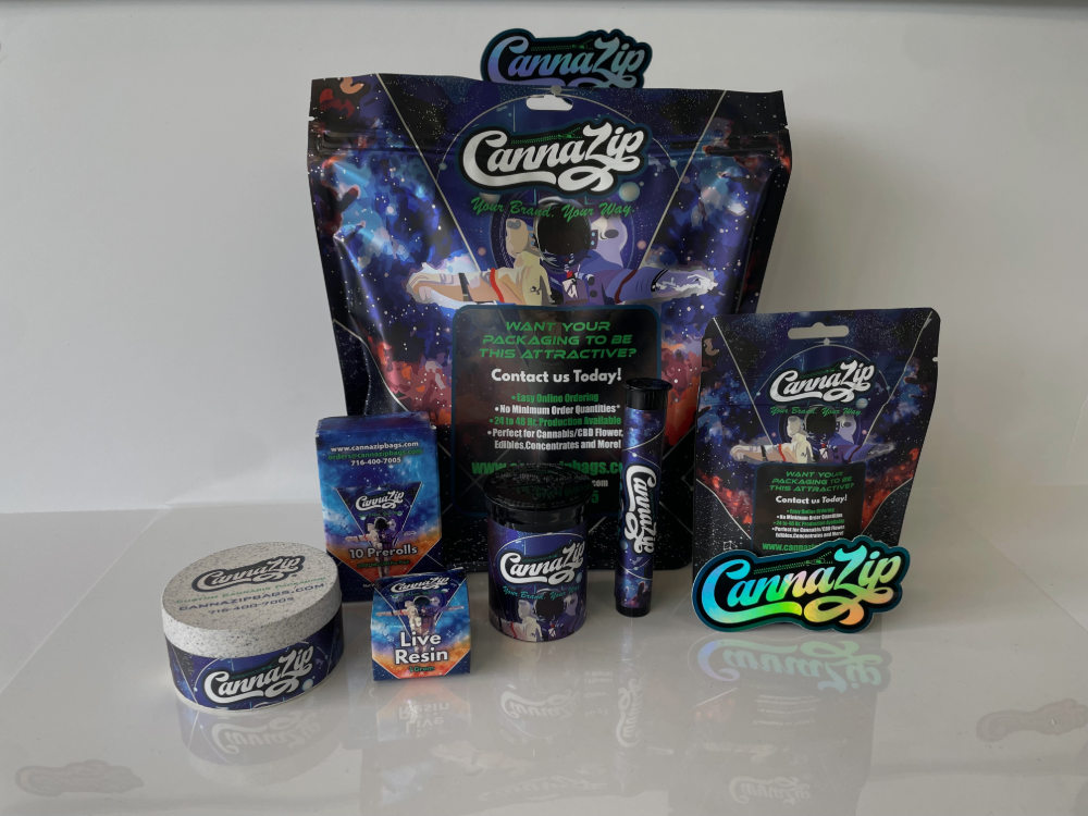
Custom cannabis bags give color a large role in the overall presentation because the package surface itself becomes part of the message. A background color can define the entire mood of the package, while accent colors can help guide attention to logos, strain identifiers, or product information.
Printed packaging surfaces also respond differently depending on how much area is covered, how the artwork is laid out, and how the colors interact with the material. A color that feels balanced in a design file can appear heavier, flatter, or more intense once printed across the full bag surface. That is why packaging color decisions should always be evaluated in practical use, not only in isolation.
Balancing color, logo visibility, and packaging readability
Good packaging color does not fight with the logo or make information harder to find. It supports visibility and keeps the package functional.
Background color versus label contrast
One of the most important design checks is contrast. If the background color is too close to the label color or text color, readability drops fast. That weakens the packaging, no matter how attractive the palette seems. Strong contrast helps users identify the product quickly and keeps important packaging elements clear.
Matte, gloss, and finish interaction with color
Finish affects how color is perceived. Matte surfaces often soften color and can make the packaging feel more understated or modern. Gloss can increase visual intensity and make color appear more vivid. Neither is automatically better. The right choice depends on the packaging direction and the kind of impression the brand wants to create.
Common color mistakes that weaken packaging appeal
A lot of weak packaging design comes from color choices that are trying to do too much. The issue is rarely color alone. It is usually the combination of color, layout, contrast, and visual competition.
When color choices conflict with product positioning
A package should look like it belongs to the product it represents. If the color direction creates a tone that clashes with the intended presentation, the result feels off. That mismatch can make the product seem less polished, less trustworthy, or less clearly positioned.
When packaging design becomes hard to read or visually crowded
Color should organize the package, not overwhelm it. When too many strong colors compete at once, the packaging becomes harder to scan and less visually effective.
Low contrast problems
Low contrast is one of the fastest ways to weaken packaging readability. Text disappears, logos lose strength, and the design feels less clear overall. A color palette that works in theory still fails if it makes key information difficult to read.
Overuse of competing visual elements
Too many accents, gradients, highlights, or color blocks can make packaging feel crowded. Strong design usually comes from hierarchy. If everything is trying to stand out, nothing does.
Choosing a packaging direction that supports the product
The strongest cannabis packaging design connects color choices to product goals, audience expectations, and the kind of presentation the packaging needs to deliver. Color should support the product, not distract from it.
Aligning color choices with product category and brand presentation
A useful packaging direction starts by clarifying what the package needs to communicate. Is the goal to look premium, clean, bold, or brand-led? Is readability the top priority, or is shelf impact the main driver? Once those priorities are clear, color becomes easier to evaluate in a practical way.
When to move from general design ideas to custom packaging evaluation
There is a point where inspiration is not enough. Once a brand has a general design direction, the next step should be evaluating how those color ideas perform on actual packaging formats.
Clarifying design priorities before requesting packaging options
Before requesting custom packaging options, it helps to define the basics: desired presentation, readability needs, logo visibility, and how bold or minimal the packaging should feel. That makes color selection more strategic and keeps the design process focused on packaging results instead of vague preferences.
If the goal is stronger product appeal, clearer presentation, and a more intentional packaging direction, color deserves serious attention. In cannabis packaging design, it is not just decoration. It is one of the clearest tools for shaping how the packaging looks, reads, and performs.


