


Your cart is empty

Back
Cannabis Packaging Design Ideas and Custom Options
Cannabis Packaging Design Cannabis packaging design plays a major role in how a product is understood, remembered, and trusted. In a competitive retail environment, packaging needs to do more than look attractive on a shelf. It must communicate brand identity, support compliance requirements, protect the product, and create a clear experience for the customer. For … Continued
Cannabis Packaging Design
Cannabis packaging design plays a major role in how a product is understood, remembered, and trusted. In a competitive retail environment, packaging needs to do more than look attractive on a shelf. It must communicate brand identity, support compliance requirements, protect the product, and create a clear experience for the customer.
For cannabis brands, strong packaging design connects product type, strain, usage occasion, and brand personality into one cohesive presentation. Whether the product is flower, pre-rolls, edibles, concentrates, vape cartridges, tinctures, or infused beverages, the right design approach can make packaging feel intentional, professional, and retail-ready.
Effective cannabis packaging design balances creativity with practical requirements. It should leave room for warnings, product details, dosage information, batch data, child-resistant features, and other compliance-sensitive elements while maintaining a polished branded look. The goal is to create packaging that attracts attention, builds confidence, and supports how the product is sold.
Design Directions for Branded Cannabis Packaging
Branded cannabis packaging can follow many creative directions depending on the product, audience, and market position. Some brands use clean, minimal design to create a premium or wellness-focused feel. Others use bold colors, expressive typography, and custom illustration to stand out in dispensary displays.
Common cannabis packaging design directions include:
- Premium and luxury packaging for high-end flower, concentrates, and limited-edition products
- Minimalist wellness packaging for CBD, tinctures, topicals, and functional products
- Bold retail packaging designed for stronger shelf impact
- Lifestyle-focused branding that connects with a specific consumer identity
- Strain-specific systems using color, icons, or labels to organize product lines
- Eco-conscious packaging design that highlights sustainability or natural materials
- Medical-inspired packaging for a more clinical and trustworthy presentation
The strongest design direction is one that fits both the brand and the buying environment. Cannabis consumers often compare products quickly, so packaging should make the product easy to recognize, understand, and choose.
Packaging Design Decisions Tied to Product Presentation
Cannabis packaging design should be built around how the product is presented, stored, opened, and purchased. A pre-roll tube, mylar bag, glass jar, folding carton, tin, pouch, or label system each creates different design opportunities and limitations. The format affects how much space is available, where branding appears, and how compliance information is arranged.
Flower packaging may need to communicate freshness, strain identity, potency, and weight clearly. Edible packaging often highlights flavor, serving size, dosage, and ingredients. Vape cartridge packaging may require a compact layout that still supports brand recognition and essential product details. Concentrate packaging may call for a more premium or technical presentation.
Visual Identity, Compliance-Sensitive Layout Space, and Packaging Format Fit
A successful cannabis packaging design system starts with clear visual identity. The logo, color palette, fonts, graphic elements, and messaging style should work together across different product types and package sizes.
At the same time, cannabis packaging must be designed with compliance-sensitive layout space in mind. Required warnings, symbols, product facts, testing information, THC/CBD content, dosage guidance, and legal disclaimers can take up significant room. If these elements are not considered early, the final package can feel crowded or difficult to read.
The best results come from aligning three key elements:
- Brand identity — the look, feel, and personality of the cannabis brand
- Compliance space — the areas needed for required information
- Packaging format — the physical container, label, pouch, box, or retail-ready structure
When these elements work together, packaging feels professional, compliant-conscious, and commercially effective.
Packaging Formats That Shape Design Direction
Cannabis packaging design is strongly influenced by the format itself. A design that works well on a stand-up pouch may not translate effectively to a small jar label, pre-roll tube, folding carton, or edible box. Each format creates different opportunities around branding, label placement, compliance information, product visibility, and shelf presentation.
Choosing the right format early helps shape the overall design direction. It affects available graphic space, customer interaction, and how the product appears in a retail setting. A strong design approach considers the full packaging system, including primary packaging, secondary packaging, labels, inserts, tamper-evident elements, and display needs.
Mylar Bags and Flexible Packaging Design Applications
Mylar bags and flexible packaging are widely used across the cannabis industry because they are versatile, lightweight, protective, and suitable for many product categories. They are commonly used for flower, edibles, gummies, pre-roll multipacks, and infused products that require barrier protection or resealable functionality.
From a design perspective, mylar bags offer a large front-facing surface for bold brand visuals, product names, strain information, flavor cues, and color-coded systems. Flexible packaging can also support matte textures, gloss accents, metallic effects, transparent windows, and custom illustrations.
However, mylar bag design must also account for warning labels, net weight, potency information, ingredient panels, QR codes, batch labels, and child-resistant zipper placement. The best designs separate the front-facing brand message from secondary compliance and product details.
Boxes, Labels, and Supporting Packaging Components
Boxes, labels, sleeves, wraps, and inserts each bring a different design challenge. Folding cartons are often used for vape cartridges, tinctures, edibles, concentrates, and premium cannabis products. They provide multiple panels for storytelling, directions, product education, compliance information, and brand messaging.
Labels are commonly used for jars, bottles, tubes, tins, and concentrate containers. Because label space is often limited, the design must be highly intentional. Brand marks, product names, strain details, cannabinoid information, and required warnings may all need to fit within a compact layout.
How Format Affects Panel Space, Layout Hierarchy, and Visual Impact
Every cannabis packaging format changes how information should be organized. Larger formats can support more visual storytelling, while smaller formats require tighter messaging and stronger hierarchy. The most important information, such as brand name, product type, strain, flavor, potency, or quantity, should be easy to identify first.
Visual impact also depends on how the package is displayed. A pouch standing upright on a dispensary shelf needs a strong front-facing design. A tube in a display case may need high-contrast labeling. A box may benefit from top-panel or side-panel branding if products are stacked.
Cannabis Packaging Design Gallery or Visual Examples
A cannabis packaging design gallery helps turn abstract ideas into practical direction. Instead of only describing a brand as premium, minimalist, bold, wellness-focused, or lifestyle-driven, visual examples make those choices easier to evaluate. They show how color, typography, packaging format, layout structure, and finishing details work together.
Branded Design Examples by Packaging Style
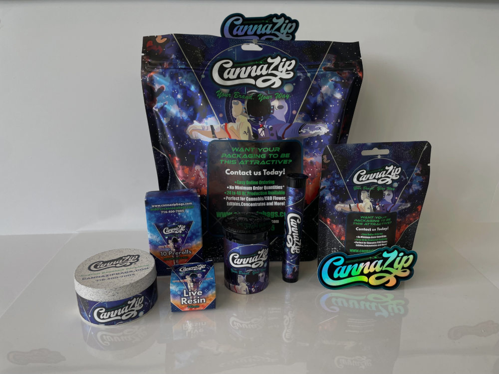
Cannabis packaging can take many visual directions, including clean minimalist mylar bags, bold pre-roll packaging, premium concentrate boxes, colorful edible pouches, wellness-inspired tincture labels, or luxury cannabis gift packaging.
Visual examples also help brands see how design can stay consistent across multiple formats. A branded system may include matching mylar bags, jar labels, cartons, pre-roll tubes, and display boxes while still allowing each product type to feel distinct.
Layout and Finish Variations That Change Shelf Presence
Small design changes can have a major effect on shelf presence. A centered logo with minimal text can create a clean and elevated look, while large product names and high-impact color blocking can make packaging easier to notice from a distance. Matte finishes can feel soft and premium, while foil, gloss, spot UV, or holographic details can create stronger visual contrast.
Color Use, Typography Hierarchy, Window Placement, and Surface Treatment
Color can separate strains, indicate flavor, suggest potency, or create a consistent product family. Typography hierarchy helps customers quickly identify the brand, product type, strain, potency, and key details. Window placement can build trust by showing the product, while surface treatments such as embossing, soft-touch coating, foil stamping, and textured materials can increase perceived value.
When used intentionally, these details help cannabis packaging feel polished, memorable, and aligned with the brand’s market position.


